Use Sublimation PNG Files Without the Stress
You know that moment when a design looks perfect on screen, but the finished make comes out blurry, dull, or slightly the wrong size? That is rarely because you picked a bad PNG. Most of the time it is one small setting – paper size, scale, colour profile, or a sneaky background layer – that throws everything off.
This guide is here to calm that whole process down. If you have been wondering how to use sublimation PNG files in a way that feels repeatable (especially when you are squeezing crafting time into a busy week), you are in the right place.
What a sublimation PNG actually is (and why it matters)
A sublimation PNG is typically a high-resolution image file with a transparent background. That transparency is the big win – it means your design can sit neatly on a product colour without a visible white box around it.
PNG is not a printing magic trick on its own, though. Sublimation success depends on the whole chain: design resolution, correct sizing, the software you print from, your printer and ink setup, and your heat press settings. If one link is off, the finished item will tell on you.
The good news is once you get a reliable routine, it becomes almost automatic.
Step one: check your file before you touch any print settings
Before you open your printing software, take 30 seconds to look at three things.
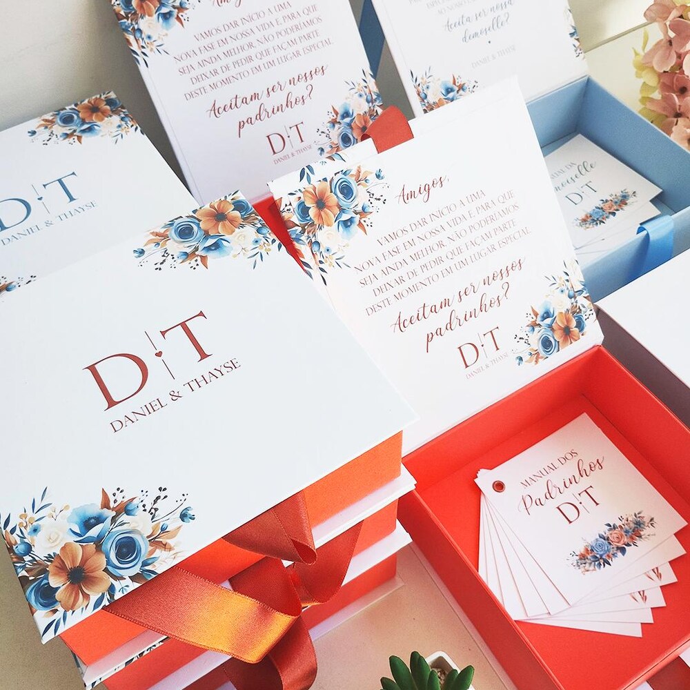
First, confirm it is the right type of design for your project. A full wrap for a 20oz skinny tumbler is different from a simple front design for an 11oz mug. If you are buying ready-to-use assets, the listing should state the intended product and sizing.
Second, zoom in and check edges and small text. Crisp edges at 200-300% zoom are a good sign. If you see pixel stair-steps on curves or lettering, it may be too low-resolution for sublimation.
Third, make sure the background is truly transparent if you need it to be. Some designs look like they have no background, but actually sit on a white layer. That is fine for white substrates, but it is not what you want on coloured tumblers or shirts.
Step two: size it the calm way (so you stop wasting paper)
Sizing is where most time and money gets burned, especially if you are guessing.
If you are using a premade wrap file, treat it like a pattern piece. Your goal is to print at 100% and trim to fit, not to stretch it until it “seems right”. Stretching is how circles become ovals and text starts to look oddly wide.
If you are placing a single PNG on a page (for example a centred design on a mug), decide the finished dimensions first. For mugs, many makers keep front designs roughly in the 3 to 3.5 inch wide range depending on the artwork. For shirts, it depends on size and style, but you still want to set a real measurement rather than dragging corners by eye.
A practical routine is to create a blank canvas in your design software at the exact size you need (in inches), place the PNG, then export or print without changing scale. This reduces the chance of accidental resizing in the print dialogue.
A quick word on resolution
For sublimation, 300 DPI is the usual sweet spot. If your software asks for DPI when you create the canvas, choose 300. If it does not ask, do not panic – what matters is that the artwork prints at a crisp size, not that you can tick a particular box.
Step three: choose software you can repeat (not the fanciest option)
You do not need complicated software to get professional results. You need software that lets you place the PNG, set the size, and print without “helpful” automatic adjustments.
Some people use design programs like Canva, Photoshop, Affinity, Silhouette Studio, Cricut Design Space, or even dedicated sublimation print tools. The right choice depends on what you already know and whether you are doing wraps, single designs, or building layouts for bulk printing.
Whichever you use, look for these controls: exact sizing, the ability to turn off auto-enhance options, and a predictable print output.
Step four: get your print settings right (this is where colour lives or dies)
If there is one place to slow down, it is the printer settings. Dull prints usually come from one of two things: the wrong paper setting or colour management fighting you.
Start with the basics. Make sure you are printing on sublimation paper with sublimation ink. Regular inkjet ink will not sublimate properly, and copy paper can cause bleeding or muted transfers.
In your printer preferences, you are typically choosing a paper type and quality. Many makers use a higher quality setting because it lays down ink more evenly. The exact names vary by printer brand, so you may need a little trial run on your specific model.
Then there is mirroring. Anything that includes text needs to be mirrored before pressing, otherwise it will read backwards on the final product. Some software mirrors in the print dialogue, some requires you to flip the design on the canvas first. Pick one method and stick to it so you do not double-mirror by accident.
Colour management: it depends, but you can keep it simple
Colour is the most confusing part because it is part art, part science, and part “your setup”. Many sublimation printers use ICC colour profiles to improve accuracy. If you have a profile for your printer and paper combination, it can help keep tones consistent.
At the same time, it is possible to over-correct if both your software and printer are managing colour. If your prints look strangely tinted (too red, too green, or muddy), you may have colour management turned on in two places.
If you are a beginner, focus on consistency: use the same paper, the same settings, and the same blanks while you dial in your results. Once you love your outcome, save those settings as your default routine.
Step five: pressing basics that actually affect your PNG results
A perfect print can still transfer badly if pressing is rushed.
First, use the right blank. Sublimation needs a poly coating or high polyester content to bond properly. On mugs and tumblers, make sure you are using sublimation-ready blanks. For fabric, higher polyester content produces brighter results. That is not a flaw, it is just how sublimation works.
Second, prep your surface. Lint and dust become permanent little blue specks. A quick lint roll on fabric and a wipe-down on hard blanks is not glamorous, but it saves so much disappointment.
Third, secure the transfer. Use heat-resistant tape where needed so the paper cannot shift. Ghosting (a faint shadow beside your design) is usually movement during pressing, or lifting the paper too early.
Fourth, press time and temperature are not universal. They depend on the blank, press type, and even the thickness of your item. Use the blank supplier’s recommended settings as your starting point, then adjust if you see signs like under-pressing (dull) or over-pressing (faded, browned paper, or colour shifting).
When I upgraded to a proper tumbler press instead of trying to “make do”, my results changed overnight. I personally use an HTVRONT tumbler press and it has been one of the best upgrades in my setup — even pressure, consistent heat, and far fewer dull transfers. If you are finding your colours look flat or inconsistent, it is often the press rather than the PNG. If you want to try the same one, you can get 20% off sitewide using my link here
The tools that made the biggest difference in my setup
When sublimation feels inconsistent, it is usually not the design. It is the setup. Once I simplified my tools and stopped switching between random supplies, everything became more repeatable.
Here are the core pieces that made the biggest difference for me:
A dedicated sublimation printer with proper sublimation ink – consistency matters more than brand hopping.
Good-quality sublimation paper – cheap paper can mute colour before you even press.
Heat-resistant tape – stops shifting and prevents ghosting.
A reliable tumbler press – even pressure and stable heat across the whole wrap matter more than people realise.
You do not need the most expensive tools. You need tools that behave the same way every time so your workflow becomes predictable.
Common mistakes when using sublimation PNG files (and the quick fix)
If you have had a few frustrating results, you are not alone. Most issues fall into predictable patterns.
Blurry prints often come from resizing a small PNG up too far, printing with a low-quality setting, or accidentally saving the file in a way that compresses it. The fix is to start with high-resolution artwork and print at the intended size.
A faint grey or white box behind the design usually means the PNG is not actually transparent, or your software has added a background layer. The fix is to re-check the file layers and export with transparency, or use a version of the artwork that is designed as a true transparent PNG.
Dull colours are typically ink, paper, or pressing related. The fix is to confirm you are using sublimation ink, correct print settings, and a substrate that is genuinely sublimation-ready. Also remember sublimation prints look dull on paper – they brighten after pressing.
Uneven edges or little gaps at the seam of a tumbler wrap are sizing and wrapping tension. The fix is to measure your specific blank and allow for tiny differences between brands. Even “standard” tumblers can vary slightly.
Using PNGs for products you want to sell
If you are making items for Etsy, craft fairs, or local orders, the design side is only half the story. You also need to be clear on licensing.
Some PNGs are personal use only. Some allow small-business commercial use. PLR products go a step further and can allow you to repackage or resell within stated terms. The important part is reading the licence attached to the file and keeping it with your records so you do not have to re-check every time you restock a best-seller.
If you are building a small library of designs in multiple niches (seasonal, funny, faith, occupations, bookish themes), it can be calmer and more cost-effective to buy in bundles or a pass rather than grabbing one-off files when you are already under time pressure. That is exactly why shops like That Digital Mum organise files by product type and size, so you can choose a tumbler wrap that matches your blank without doing design maths at midnight.
A simple workflow you can reuse every time
Once you have your first successful press, your goal is not perfection – it is repeatability. Keep a small note of what worked: the blank type, the print settings, whether you mirrored in software or print dialogue, press temperature, and time.
When you repeat the same workflow, you will start spotting what actually changes outcomes. That confidence is what turns sublimation from “a gamble” into a reliable part of your side hustle.
If you only take one mindset shift with you, let it be this: you do not need more hours or more talent. You need a calmer system you can trust, even when you are crafting in short pockets of time after everyone else is finally in bed.
Ready to Turn This Into Your First Digital Product?
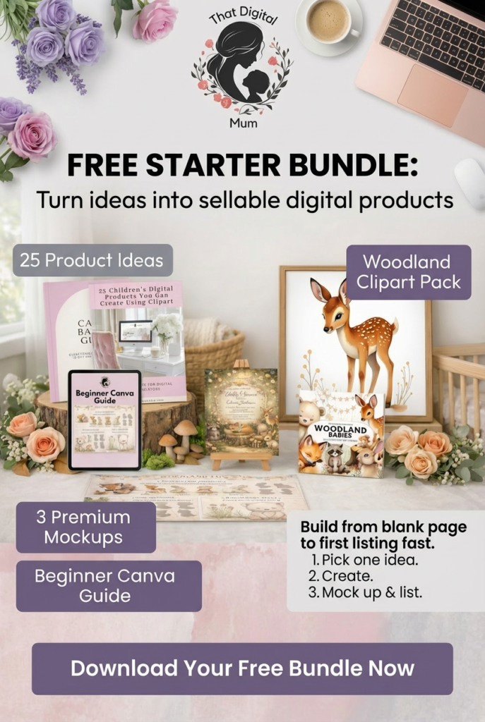
If you’re reading this thinking “this sounds great, but I don’t know what to actually create first” — I made something for you.
The That Digital Mum Free Starter Bundle walks you through the exact process I used to start selling digital products as a busy mum.
Inside you’ll get:
• 25 product ideas you can create this week
• A beginner-friendly Canva guide
• 3 premium mockups to make your listings look professional
• A woodland clipart pack to start designing immediately
No fluff. No tech overwhelm. Just a clear starting point.
Grab it here.